
RALPH HORSLEY TALKS BOARDS
Ralph Horsley has been working as a freelance illustrator within the games industry for over a decade. When not toiling at the drawing board he can be found playing games (roleplaying, board, card, or tabletop), model making, listening to music, or simply enjoying a pint. Check out Ralphs website to see more of his work.
What sort of brief were you given for the project?
I attended a meeting at GW's Nottingham HQ with Zoe, in the course of which we discussed the previous editions, what we felt to have worked well, and the direction that was intended. Zoe was keen to strongly reference the 2nd edition. This was thought to be the most iconic, and also the one which had most strongly embraced the high fantasy, non-Warhammer, elements we wished to emphasise.
Did you offer any thoughts or feedback that changed the brief?
Working with Zoe has proven to be very collaborative. Whilst she offers a clear lead she has always been good at encouraging input. I too especially liked the approach of the second edition, but suggested a different overall concept for the board.
In the previous edition the view in each square has it's own horizon line. The view is front on.Whilst this works well for illustrative purposes it created large blank areas of 'sky', and made the whole board feel a little disjointed. I suggested opting for a 'top-down' view. I felt this would avoid creating the blank areas, would enable the river and mountains to act as natural borders between the zones, and create a unified geographic whole.
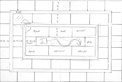 |
| Rough early layout of the board sections. |
What art materials did you use and why you like using them?
I sketched the board out with pencil onto mount board. The latter has a a smooth surface, similar to cartridge paper, is reasonably absorbent, and it's thickness makes it robust.
I then painted it with acrylic miniature paints. Games Workshop's own range being amongst my selection. I favour acrylics because they are incredibly versatile.As they are water based you can easily dilute them for use as a, watercolour-like, wash, or keep them nice and opaque. The drying time is incredibly fast, and they lend themselves to fine detail.
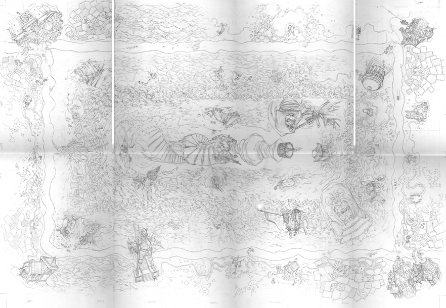 |
| Sketch of board - click to enlarge. |
 |
| Rough draft of board - click to enlarge. |
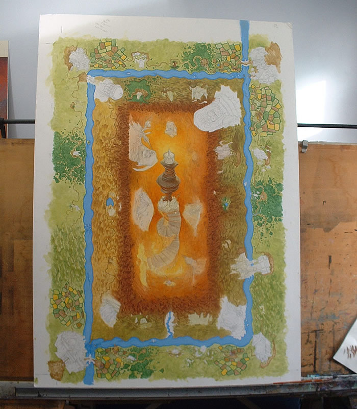 |
| Board underway - click to enlarge. |
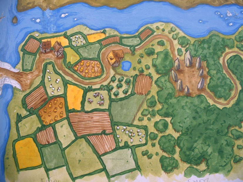 |
| A close up of the work in progress board - click to enlarge. |
I pick 'n' mix heavily, and steal influences from wherever they come, a lot of them probably not consciously. This might be films, comics or historical sources. The latter is usually at the heart of my armour or costume designs. Artists I admire are often the ones that work very differently to my own approach, or else they employ something I particularly like, say an interesting lighting effect, which I will then try to appropriate for myself.
In which ways was creating the art for the board different to painting the cover art?
It was a lot bigger. I work at 150-200% actual size. This means that when scanned in and reduced to actual size for printing everything tightens up, and looks more detailed. However it did mean that I was working with a very large piece of work.
Otherwise a lot of the considerations are remarkably similar. I was looking for the overall impact of the composition. In this instance the distinction between the different areas, and focus on the Crown of Command, combined with smaller vignettes, or elements, whose detail helps add to the interest of the whole.
Can you tell us a bit about the design process - how did you choose how to depict the different areas of the map?
I wanted to closely reference the 2nd edition. This meant that the board is facing in all directions at once. I like the fact that regardless of where you are sat the nearest part of the board to you is also facing you.
In the previous edition certain characters spilled out beyond their 'space'. This seemed to have no real internal logic. I felt it made the board less easy to read, and felt too chaotic. Instead I decided to contain each squares action within it's own space, but where possible reference the original character designs. When the square contained terrain I used this to help create the topographical flow around the board. This was further emphasised by the changing palette. The outer edge uses the lushest most natural colours, whilst the valley of Fire is, unsurprisingly, very red. lastly I tried to include some unique details in each square, maybe just a skull, or signpost, but something.
What parts of the process did you find particularly enjoyable or frustrating?
I especially enjoying reinterpreting the board in an attempt to create the complete world. Okay, by necessity there was a degree of contrivance, but I was happy with the overall bird's eye view of the world.
I also took pleasure in trying in re-imagining the features/characters for each square, and in trying to create the little bits of detail. Even just a thinking of a different volcano to tuck into the mountains amused me. I think this must have appealed to staff at GW, as I ended up getting requests to squeeze in particular monsters into the river.
Any hidden references or gags in the pictures?
Only really references to the 2nd edition, but I do find myself creating narratives for the characters, or settings, as I work on that element.
Visually speaking, how would you say the board art has changed from earlier editions to what you produced for this edition of Talisman?
Hopefully it has a stronger overall look. I was also wanting to give strong visual clues to each square. Squares with the same effect on game play should look very similar. From a distance I hope you can pick out all the farms, deserts, etc.
Was the feedback received during the process useful, what was the thinking behind last minute alterations?
As I indicated earlier working with Zoe was an easy relationship. I think we managed to identify all the troublesome, or technical areas, in advance. That combined with a sensible schedule meant that the issues were addressed whilst they were still easy to alter. The alterations at the end, adding a single figure, and river monster, were tiny - thankfully.
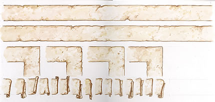 |
| The scrollwork for the captions and instructions was made seperately. |
What is your favourite Talisman memory?
Reading the emails from Zoe saying that the board and cover had been approved, and that I could now submit an invoice :)
Oh, and sitting around a table with a bunch of friends, a few beers, and lots of snacks, whilst having my character repeatedly turned into a Toad.
Which Talisman character is your favourite?
I particular like Jeremy's reinterpretation of the Thief - that is a man on a mission - to get away!
What is your favourite thing about the new edition?
Having had the chance to be involved with it, seeing my artwork on that snazzy black box cover, and knowing that this classic game lives again.
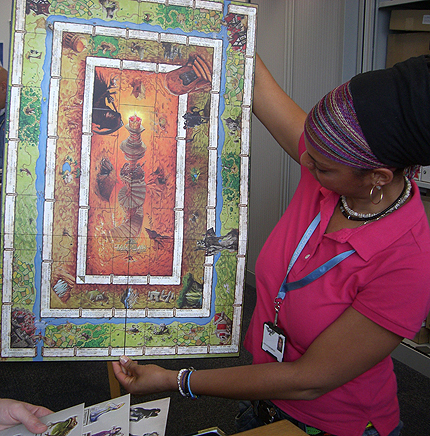 |
| Zoe Wedderburn goggles at the finished board in all it's glory. |
• Buy Talisman
• Talisman T-Shirt
• Talisman FAQ
• Reviews
• Downloads
> Wallpapers
> Trailer
> Card Template
> Characters
Roleplaying games
• Warhammer Fantasy
• Warhammer 40,000
Board games
• Talisman
About us
• Who we are
• About Black Industries
• Black Industries FAQ
• Contact us
• Our blog
• Announcements
• Forums
• Newsletters
• Fan sites
• Gaming clubs
• Events
• WFRP Products
• Dark Heresy Products
• Talisman
• View your cart
• Shipping charges
• Delivery times
• Privacy policy
• Terms & conditions
• Returns
• Trade information
A division of
Games Workshop